Theatre:
Expressionist
Expressionism is a modernist movement in drama and theatre that developed in
Europe (principally Germany) in the early decades of the 20th century
and later in the United States. It forms part of the broader movement of Expressionism in the arts.
Shows within
this genre and how they are lit:
Expressionist theatre is a very abstract and surrealist aspect of theatre and is incredibly tricky to light. You don't just have to translate meaning and understanding through the lighting you use but also you will have to understand the psychological and semiotic aspects of lighting for this genre.
In this play called 'A Dream Play' by August Strindberg it is important to understand the concept and narrative of the piece. However you must remember that for many members of the audience the understanding of this can be very different. Two people could see the same scene but get something completely different from it.
Plot: "The primary character in the play is Agnes, a daughter of the Vedic god Indra. She descends to Earth to bear witness to problems of human beings. She meets about 40 characters, some of them having a clearly symbolical value (such as four deans representing theology, philosophy, medicine, and law). After experiencing all sorts of human suffering (for example poverty, cruelty, and the routine of family life), the daughter of gods realizes that human beings are to be pitied. Finally, she returns to the Heaven and this moment corresponds to the awakening from a dream-like sequence of events."


http://vimeo.com/43818725
Plot:
"How to Train Your Dragon is a series of twelve children's books written by British author Cressida Cowell. The books are set in a fictional Viking world and focus on the experiences of protagonist Hiccup and his tribe as they train Dragons as pets."
How to Train Your Dragon originally by Cressida Cowell is a children's novel that has been reproduced in many formants over many years. "In March 2012, Global Creatures teamed up with Dreamworks to launch a live theatrical show based on the film "How To Train Your Dragon." Spinifex Group was contracted to develop the graphic content for the entire show. The brief was to take the movie from it's original look and portray it in a more illustrative style." Even though in this adaptation does not have a lot of lighting design incorporated in it the whole set, apart from the dragon is projection mixed with lighting. The designers have tried to create a fantasy world that the audience can experience. They have used high key lighting together with dark tones to create a mysterious a fanciful atmosphere. They used blue side light to create this depth.
 They have also used follow spots and spot lights to highlight the actors and the dragon. This is to draw in the audiences attention. This light, because it's from directly above has created multiple shadows.

Plot: "The primary character in the play is Agnes, a daughter of the Vedic god Indra. She descends to Earth to bear witness to problems of human beings. She meets about 40 characters, some of them having a clearly symbolical value (such as four deans representing theology, philosophy, medicine, and law). After experiencing all sorts of human suffering (for example poverty, cruelty, and the routine of family life), the daughter of gods realizes that human beings are to be pitied. Finally, she returns to the Heaven and this moment corresponds to the awakening from a dream-like sequence of events."

I have picked a scene from the end of the play to look at as I feel the lighting in this scene are something that really impacts the scene and give the audience the understanding they need to complete the narrative and give them closure. As she ascends to heaven she reflects on her time on earth through song. It is evident to the audience that she is going back to heaven through the o/w light that is used. In western societies this has connotations of holiness and purity. The angle of the light is also important in this scene. The light comes in the form of a spotlight from directly above her, this casts very dark shadows on the contours of her face and body. It could suggest that is hopeful yet tarnished by what she has witnessed. This theory could also be added to by the use of projected colours on her body, eg cold blues, reds and yellows. These colours also add a very abstract feel the scene but because of the cold hue of the colours and the way they bounce of her ivory skin creates a very haunted and disturbing feel to the scene. As she ascends the o/w light becomes more intense and her whole body is shafted by the light and is barely viable, this suggests she is disappearing/ascending to heaven in a dream like state. However if this scene was to play out to an Asian audience using the same colours. They could think she has died or been consumed by a spirit. As white light has connotations of death and phantoms in their culture. Also psychologically some people believe a white flash of light is what you see right before you die.


http://vimeo.com/43818725
Fantasy
Plot:
"How to Train Your Dragon is a series of twelve children's books written by British author Cressida Cowell. The books are set in a fictional Viking world and focus on the experiences of protagonist Hiccup and his tribe as they train Dragons as pets."
How to Train Your Dragon originally by Cressida Cowell is a children's novel that has been reproduced in many formants over many years. "In March 2012, Global Creatures teamed up with Dreamworks to launch a live theatrical show based on the film "How To Train Your Dragon." Spinifex Group was contracted to develop the graphic content for the entire show. The brief was to take the movie from it's original look and portray it in a more illustrative style." Even though in this adaptation does not have a lot of lighting design incorporated in it the whole set, apart from the dragon is projection mixed with lighting. The designers have tried to create a fantasy world that the audience can experience. They have used high key lighting together with dark tones to create a mysterious a fanciful atmosphere. They used blue side light to create this depth.


Tradegy
Tragedy is a form of drama based on human suffering that invokes in its
audience an accompanying catharsis or pleasure in the
viewing.
http://www.theatrecrafts.com/files/LSI_april_2011_frankenstein.pdf
Frankenstein National Theatre Live:
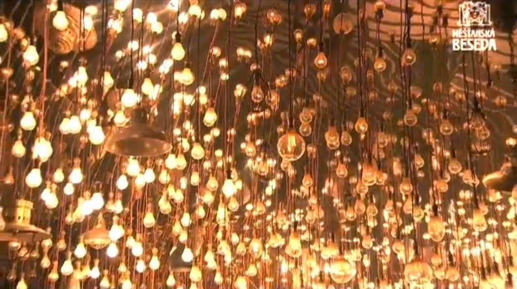
 "Triangular in form, the ceiling consists of a mirrored surface below which hang just over 3100 assorted light bulbs. Conceived by Boyle, set designer Mark Tildesley and lighting designer Bruno Poet it was intended to “represent the forces of electricity harnessed by Frankenstein, and to provide a dazzling light for the moment the creature is born and opens his eyes for the first time,” the lighting designer explains." “My dream was to have individual control of each bulb; we researched various ways of achieving this, but it was looking unaffordable. I called Dave Isherwood at White Light for advice, and he was brilliant - he found a very low-cost 12-way dimmer rack from NJD which would let us afford 1000 dimmers. So we divided the surface of the ceiling into 1000 equally sized ‘pixels’ and paired together whichever bulbs hung within each pixel. I realised that I had created a monster of wiring, cabling, patching and control; I was staggered by everyone’s enthusiasm to make it work!”


 The lighting inside the mechanics and behind the actors reflects the industrial age the show is set in. Also the way the light hits the smoke adds to this mechanical and claustrophobic atmosphere of the Victorian industrial age.

http://www.theatrecrafts.com/files/LSI_april_2011_frankenstein.pdf
Frankenstein National Theatre Live:

This is the lighting design for just the light bulbs.


Musical
"Musical
theatre is a form of theatre that combines songs,
spoken dialogue, acting, and dance.
The story and emotional content of the piece – humour, pathos, love, anger – are communicated through the words,
music, movement and technical aspects of the entertainment as an integrated
whole. Musical spoon feeds the audience
with pre assumed endings, solutions and imaginings.
Evita:
Evita is commonly known within the theatre world with an iconic image.
This iconic image is predominantly due to the lighting and what style effect and meaning it creates for the audience. The main themes of the musical Evita is power and success. In this particular scene Eva is speaking to her people and wanting them to remember and respect her. Eva is standing on the balcony with warm indoor lights shining from behind the windows which reflects her loving and passionate nature. There is also a bright which light that shines on to and from behind her. In western societies white has connotations of hope, prosperity and power. It is a strong and forceful tone. The light is extremely powerful and harsh in the audiences eyes this makes the audience feel intimidated and in awe of her, as if she is a shining beacon of hope for the people. This translates the themes of the narrative well.


Evita:
Evita is commonly known within the theatre world with an iconic image.
This iconic image is predominantly due to the lighting and what style effect and meaning it creates for the audience. The main themes of the musical Evita is power and success. In this particular scene Eva is speaking to her people and wanting them to remember and respect her. Eva is standing on the balcony with warm indoor lights shining from behind the windows which reflects her loving and passionate nature. There is also a bright which light that shines on to and from behind her. In western societies white has connotations of hope, prosperity and power. It is a strong and forceful tone. The light is extremely powerful and harsh in the audiences eyes this makes the audience feel intimidated and in awe of her, as if she is a shining beacon of hope for the people. This translates the themes of the narrative well.

As you can see more clearly in this shot they use spotlights on Eva and they flash them on full at moments to give the illusion of camera flashes. This suggests she is being photographed by lots of photographers which in turn reflects the narrative and the themes of the show. This artistic and effective use of the spotlights is very different to how films would be lit in the same situation. They would have actual cameras and flashes on the actors and the camera would follow the camera lights and the actors. They may also have a light box/board on the actors to highlight their faces with a high key light to further this effect. They also would not have the light shining behind the character. Musicals like to spoon feed the audience to the characters intentions and their ideals. This is done through the lighting, props and set. In television of films you have to guess more, you rely on the acting and the character development. You are able to do this because television shows and films tend to be longer and more drawn out in terms of character development. Theatre is fast paced and the director wants the audience to quickly understand what is happening. Also the placement of the audience effects this concept. A theatre audience is usually far from the stage and needs bigger signals that are achieved through lighting and props. Where as in Television and Film the audience are either surrounded by the screen or are close to their television set.

Vaudeville
Vaudeville was a theatrical genre
of variety entertainment popular in the United States and Canada from the early 1880s until the early 1930s. Each performance
was made up of a series of separate, unrelated acts grouped together on a
common bill. Types of acts included popular and classical musicians, dancers, comedians,
trained, magicians, female and male impersonators, acrobats, illustrated, jugglers, one-act plays or scenes from plays, athletes,
lecturing celebrities,
minstrels, and movies. A vaudeville performer is often referred to as a vaudevillian .
Shaw & Lee Vaudeville Legends (1949) was a Vaudeville stage show that's main priority was to entertain a wide audience. Comedy sketches, gags and music acts were among the types of performances put on at a Vaudevillian theatre. The lighting for theses types of shows are extremely simplistic and they are what established the iconic image of theatre lighting, (The spotlight on a stage curtain). Unlike most narrative, musical or theatrical productions the stage curtain remained closed as was often used as a gag in most acts. A simple spot light is shone on either side of the actors and one in the centre. This type of lighting creates two shadows of the performer and gives a very distinctive style to the performance. Also because of the bright use of like the actors would wear heavy make-up and eye-liner to extrude their features as the light would often be so harsh that it would wash out their faces. There was no way of controlling the intensity or direction of the light. In these early years the performers would often just stand in a large spotlight that did not move in anyway. this meant that the actors could not move.


Shaw & Lee Vaudeville Legends (1949) was a Vaudeville stage show that's main priority was to entertain a wide audience. Comedy sketches, gags and music acts were among the types of performances put on at a Vaudevillian theatre. The lighting for theses types of shows are extremely simplistic and they are what established the iconic image of theatre lighting, (The spotlight on a stage curtain). Unlike most narrative, musical or theatrical productions the stage curtain remained closed as was often used as a gag in most acts. A simple spot light is shone on either side of the actors and one in the centre. This type of lighting creates two shadows of the performer and gives a very distinctive style to the performance. Also because of the bright use of like the actors would wear heavy make-up and eye-liner to extrude their features as the light would often be so harsh that it would wash out their faces. There was no way of controlling the intensity or direction of the light. In these early years the performers would often just stand in a large spotlight that did not move in anyway. this meant that the actors could not move.

Taken from the style of Vaudeville Judy Garlands performances adopted a similar lighting style. The modernisation of the genera saw the use of follow spots and the reduction of shadows. As the introduction of colour film was born they would also now experiment with muted tones and back light. This stylised the performances and made them more polished. As you can see in this performance of Too Hot for Easter Parade by Judy Garland they have used blue sidelight as back light to bring her off the curtain and one follow spot to highlight her. She can now move around the stage to deliver her performance. Unlike Film and Television they use very simple lights to show a music performance instead of 'oversyleising' the performance. For example in the film Shame one of the main characters performers at a local bar a very warm orange light is used and she is only lit from one side so there is a dramatic darker tone on one half of her face. In theatre they would not normally have this as they would want the entire face to be lit unless it was for a dramatic effect that reflected the characters inner emotions.


